Analytics
Learn how to use the redesigned Analytics page — one dashboard with five tabs, a shared filter, and export — to track your loyalty program and know exactly what to do next.
Who can use this feature?
The Analytics page is available on all plans. The metrics and widgets you see depend on the features your plan unlocks — analytics for a feature that isn't part of your plan (for example VIP Tiers) won't appear. Upgrade your plan to unlock more features, and the matching analytics show up automatically.
What is the Analytics page?
Analytics is your loyalty program's control room — it turns raw customer data into decisions. It has been fully redesigned: instead of jumping between separate pages, everything now lives on one page with five tabs, controlled by a single filter that applies to every chart. Every number comes with a plain-language tooltip that explains what it means and what to do about it, you can customize which metrics each tab shows, and you can export the whole thing to Excel in one click.
Why do you need it?
Analytics shows you what's working and what isn't, so you can invest where it pays off. Use it to prove your loyalty program's ROI, spot where members drop off, see which rewards and tiers perform best, and decide your next move with data instead of guesswork.
This guide walks you through the page tab by tab.
Open Analytics
Go to the Joy: Loyalty Program app and click Analytics in the left-hand menu.
At the top you'll see five tabs — Overview, Revenue, Members, Rewards, and Referral — with the filter bar just below them. Click a tab to switch instantly (the page doesn't reload). Joy remembers the tab you were on, and the address bar updates (for example ?tab=members) so you can bookmark or share a direct link.
Switch to the new Analytics
If you used the previous Analytics dashboard, you'll be invited to try the new one first.
Open the preview
When a banner appears at the top of Analytics, click Preview to explore the redesigned page.
Make it your default
If you like it, click Save as default and the new Analytics becomes your standard view. Prefer the old layout for now? Just don't save — you'll stay on the previous version.
About historical data: a few brand-new widgets only have data from the day you upgrade onward, because they weren't tracked before. When that's the case, a short banner tells you which widgets are affected. Your data fills in from the upgrade date, and you can dismiss the banner once you've read it.
Set your filter once — it applies everywhere
The filter bar at the top controls every chart on every tab, so you only set it once.
Choose a date range
Pick Last 7 / 30 / 90 days, All time, or a custom range. It defaults to the last 30 days.
(Optional) Filter by tier
Select one or more VIP tiers to see how a specific tier is performing. Leave it on All tiers to see everyone.
(Optional) Filter by Shopify tag
Narrow the whole page to customers who carry specific Shopify tags — handy for looking at a segment like wholesale or VIP.
Your selection is remembered automatically — refresh, navigate away and back, or close and reopen your browser, and the filter stays put. Click Clear filter to return to the defaults.
Some metrics — such as Retention rate and Current point balance — are calculated all-time and ignore the date filter, because they only make sense as a running total. A couple of widgets, like Cohort retention, have their own date range.
Overview tab — your at-a-glance summary
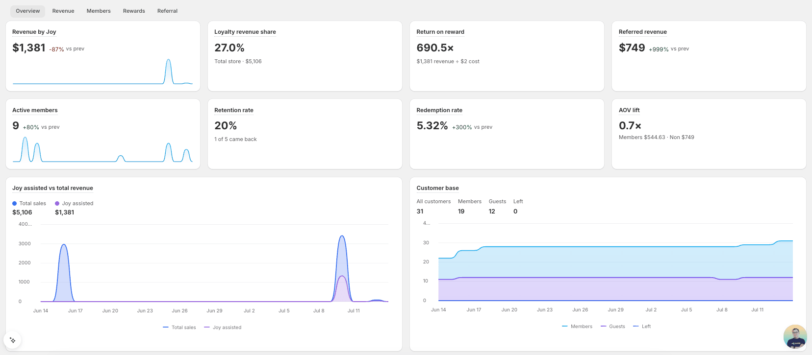
Start here. The Overview tab pulls the most important signals from across your whole program — revenue, members, rewards, and referrals — onto one screen. Because Analytics is fully customizable, you can add or hide any of these widgets to suit your store (see Customize your dashboard); here's a typical layout, top to bottom.
Scan the headline KPIs
KPI cards across the top, each with a trend versus the previous period — for example:
- Revenue by Joy — sales from orders that used loyalty.
- Loyalty revenue share — loyalty revenue as a share of your total store revenue.
- Return on reward — the revenue you earn for every dollar of reward cost (for example 690.5×).
- Referred revenue — sales generated by your referral program.
- Active members — members currently active in your program.
- Retention rate — the share of past customers who came back.
- Redemption rate — points redeemed ÷ points earned.
- AOV lift — how your members' average order value compares with non-members'.
Compare revenue and your customer base
- Joy assisted vs. total revenue (left) — an area chart of your total sales against Joy-assisted sales over time.
- Customer base (right) — All customers, Members, Guests, and Left, shown as headline counts and as trend lines.
Check points and referrals
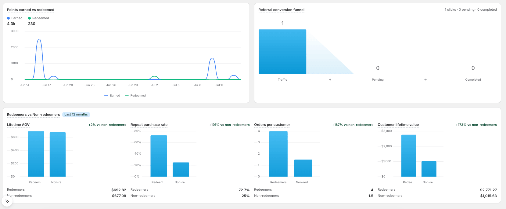
- Points earned vs. redeemed (left) — earned and redeemed points over time.
- Referral conversion funnel (right) — Traffic → Pending → Completed, showing where referrals drop off.
See the payoff of redeeming
Redeemers vs. Non-redeemers compares customers who redeem against those who don't across Lifetime AOV, Repeat purchase rate, Orders per customer, and Customer lifetime value, each with a green lift badge. This comparison covers the last 12 months.
Revenue tab — prove loyalty's ROI
This is the tab to open when you — or your boss — want the bottom line: how much money does loyalty bring in, and are your loyal customers worth more than everyone else? Read it from top to bottom.
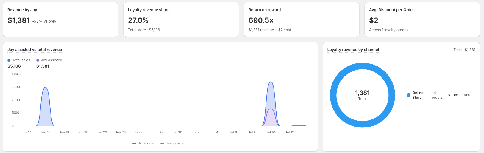
Read the revenue KPIs
Four headline numbers across the top:
- Revenue by Joy — total sales from orders that used loyalty, with the change versus the previous period.
- Loyalty revenue share — loyalty revenue as a share of your total store revenue, with the store total beneath.
- Return on reward — the revenue you earn for every dollar of reward cost.
- Avg. discount per order — the average loyalty discount given, across all your loyalty orders.
See revenue over time and by channel
- Joy assisted vs. total revenue (left) — an area chart of your total sales against Joy-assisted sales.
- Loyalty revenue by channel (right) — a donut plus a breakdown of each sales channel (Online Store, POS, and more) with its order count, revenue, and share of the total.
Check your loyalty impact
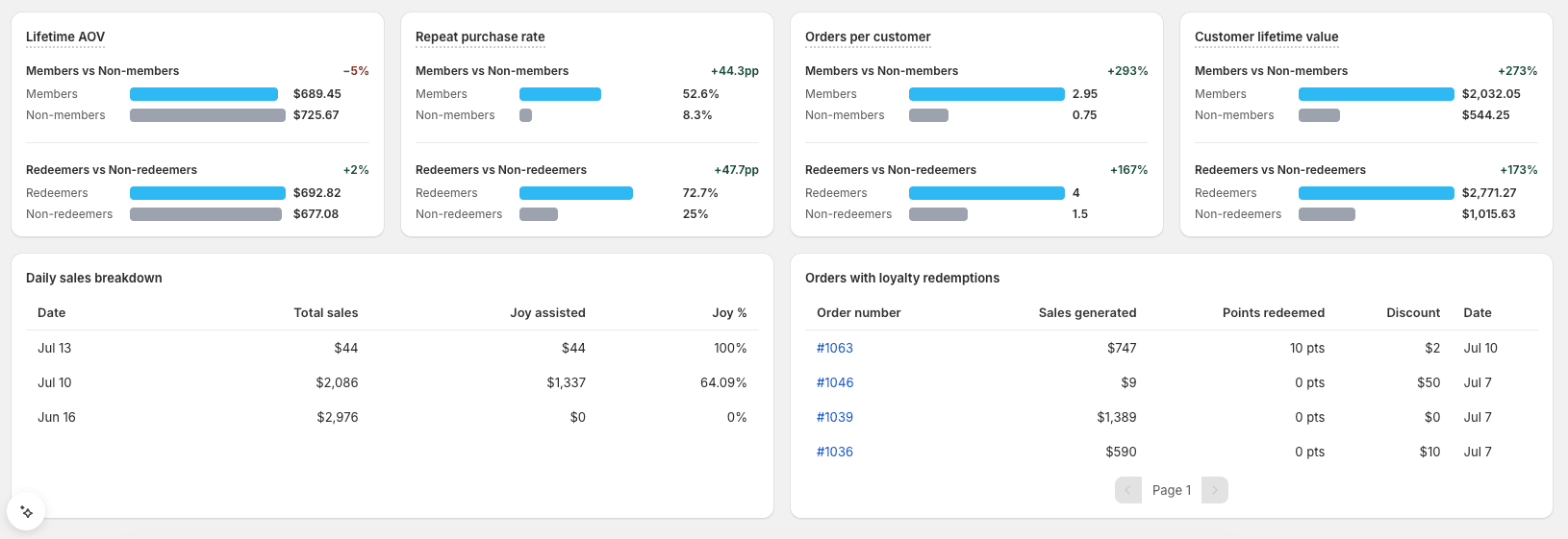
Four side-by-side comparisons prove loyalty's value. Each one shows two rows — Members vs. Non-members and Redeemers vs. Non-redeemers — with a lift badge for each:
- Lifetime AOV
- Repeat purchase rate
- Orders per customer
- Customer lifetime value
The blue bar is your loyal group and the grey bar is the baseline, with the values and the lift labelled. These are the numbers to put in front of your team.
Dig into the detail
- Daily sales breakdown (left) — a day-by-day table of Date, Total sales, Joy assisted, and Joy %.
- Orders with loyalty redemptions (right) — every order that used a redemption, with Order number, Sales generated, Points redeemed, Discount, and Date. Click an order number to open it in your Shopify admin.
Members tab — understand your members
Open the Members tab to answer: who's joining, who stays active, how well you retain them, and — if you run tiers — which tiers perform? Read it from top to bottom.
Read the four member KPIs
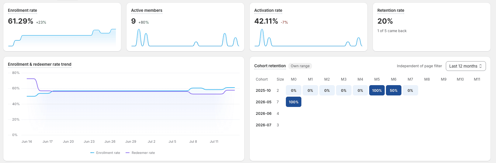
- Enrollment rate — the share of your customers who have joined the program.
- Active members — how many members are currently active.
- Activation rate — the share of members who have actually engaged, rather than just signed up.
- Retention rate — the share of past customers who came back, with the raw counts (for example "1 of 5 came back").
Track engagement and retention over time
- Enrollment & redeemer rate trend (left) — your enrollment rate and redeemer rate over time, so you can watch engagement improve.
- Cohort retention (right) — a heatmap where each row is the customers who joined in a given month, and each column (M0, M1, M2…) shows the share who came back that many months later. Darker cells mean stronger retention. It has its own date range, independent of the page filter.
Follow the funnel and your customer base
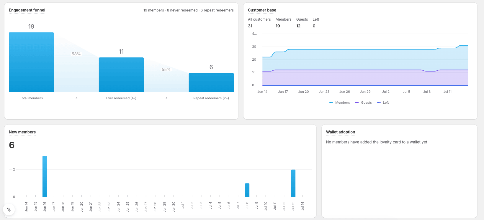
- Engagement funnel (left) — how members become redeemers: Total members → Ever redeemed (1+) → Repeat redeemers (2+), with the drop-off percentage between each stage. A big drop from members to "ever redeemed" means people join but never redeem — a sign to promote your rewards.
- Customer base (right) — All customers, Members, Guests, and Left, as headline counts and trend lines.
See new members and wallet adoption
- New members (left) — how many members joined, with the trend over time.
- Wallet adoption (right) — how many members added their loyalty card to Apple or Google Wallet, a strong signal of an engaged member.
Compare your tiers
When your plan includes VIP Tiers and you've set them up, four tier widgets appear:
- Tier distribution — how your members are split across tiers, shown as a donut.
- Tier membership trend — one line per tier, showing which tiers grow or shrink over time.
- Tier transitions — upgrades, downgrades, new enrollments, and net movement for the period. A healthy program shows more upgrades than downgrades.
- Tier performance — revenue, repeat purchase rate, and average order value for each tier, so you can see which tier pulls its weight.
The tier widgets follow the VIP Tiers feature: they appear only if your plan includes VIP Tiers and you've set them up. If tiers aren't part of your plan, or you don't run them, these widgets are hidden automatically.
Rewards tab — see your points economy
Open the Rewards tab to understand the economics of your points: how many you issue, how many get redeemed, how much is wasted, and whether your coupons get used. Read it from top to bottom.
Read the five points KPIs
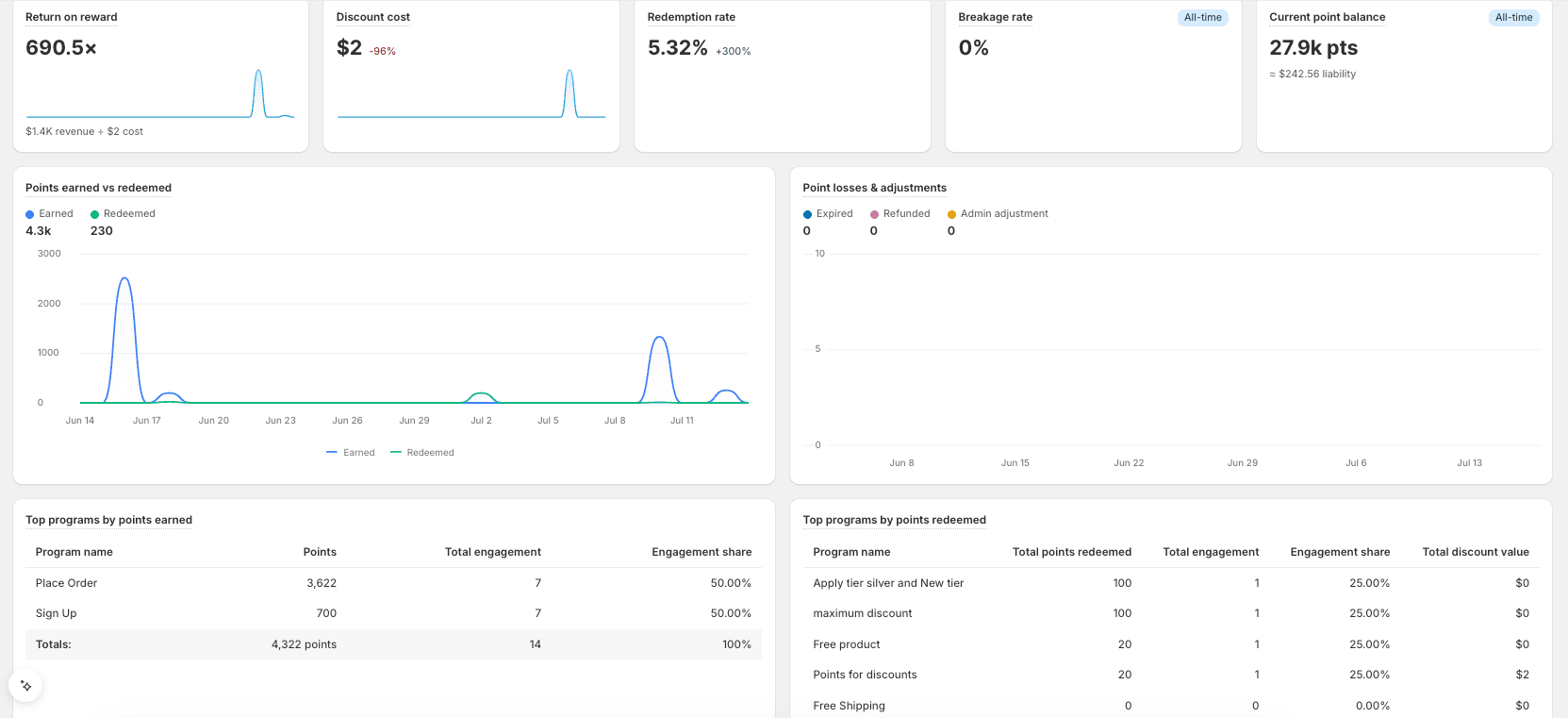
- Return on reward — the revenue you earn for every dollar of reward cost (for example 690.5×), with the underlying revenue and cost shown beneath.
- Discount cost — the total value of the discounts your rewards gave away.
- Redemption rate — points redeemed ÷ points earned. A high rate means your rewards are attractive and easy to claim.
- Breakage rate — the share of points that expire unused (all-time). Some breakage is healthy; a high rate means points are being wasted.
- Current point balance — the total points in circulation right now, with the money value of that liability (all-time).
Read the two points charts
- Points earned vs. redeemed (left) — earned and redeemed points over time, so you can see whether customers are spending what they earn.
- Point losses & adjustments (right) — expired, refunded, and admin-adjusted points over time. Watch Expired climb: it usually means your expiry window is too short, or customers aren't engaged enough to redeem in time.
Find your best programs
- Top programs by points earned (left) — which earning programs award the most points, with each program's points, total engagement, and engagement share.
- Top programs by points redeemed (right) — which rewards customers spend their points on, with points redeemed, engagement, share, and the total discount value.
See which coupons get used
- Top programs by coupons earned (left) and Top programs by coupons redeemed (right) — how many coupons each program generated and how many were used, with the discounted value and the revenue each drove.
- Coupon usage — a donut splitting every coupon you've generated into Used, Active, and Expired, with the overall usage rate. A low usage rate is an early warning that a reward isn't landing.
Referral tab — measure your referral program
Open the Referral tab to see whether your referral program is working — how many people it brings in, how well they convert, and how much revenue it drives. Read it from top to bottom.
Read the referral KPIs
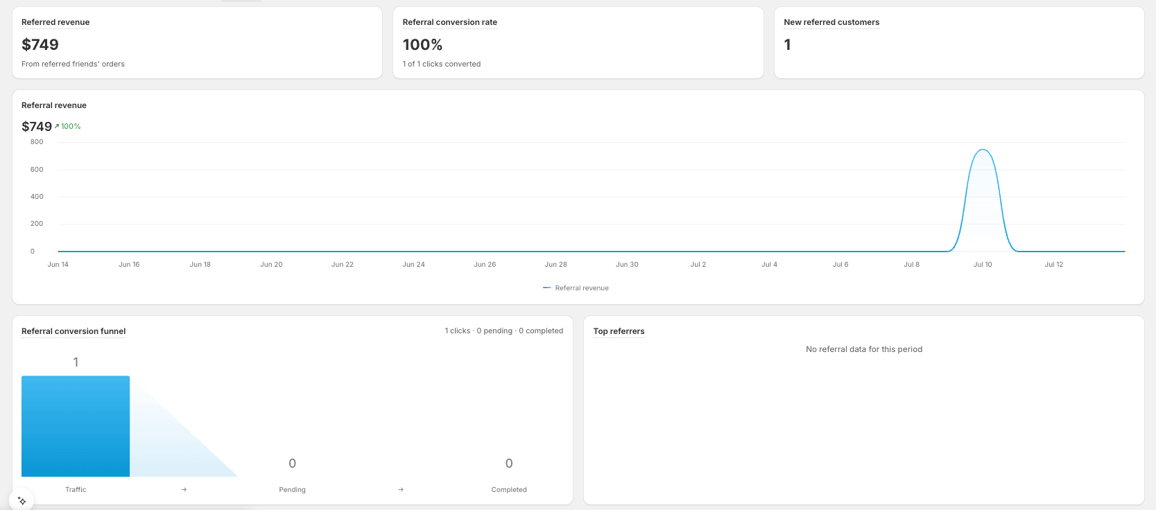
Three headline numbers, with a Referral revenue trend chart beneath them:
- Referred revenue — sales from referred friends' orders.
- Referral conversion rate — the share of referral-link clicks that converted, with the raw counts (for example "1 of 1 clicks converted").
- New referred customers — how many new customers came from a referral.
Follow the referral conversion funnel
On the lower left, the Referral conversion funnel shows where people drop off, from left to right: Traffic → Pending → Completed, with the conversion between each stage. A big drop tells you exactly where to focus — a weak landing page (Traffic → Pending) or an unconvincing offer (Pending → Completed).
Reward your best advocates
On the lower right, the Top referrers table lists the customers driving the most referral revenue — use it to spot, thank, and extra-reward your most valuable advocates.
Customize your dashboard
Every store measures success differently, so you can tailor each tab to show exactly the metrics you care about — add the widgets you want, hide the ones you don't, and make Analytics fit your store.
Click Customize
On the tab you want to change, click Customize to open the widget panel.
Choose your metrics
Browse or search the widget catalogue — it's grouped by category, such as Revenue and Commerce (Shopify). Click Add next to any widget to place it on the tab; widgets already on the page are marked Added, so you can spot and remove the ones you don't need. Want a metric that isn't listed? Click Create metric to build your own.
Save
Click Save to apply your layout. Joy remembers your customized dashboard, so it's ready the next time you open Analytics.
Read any number with tooltips
Not sure what a metric means or whether your number is good? Hover the ? next to it for a four-part explanation:
- What it means — a plain-language definition.
- How it's calculated — the exact formula.
- Watch out — a common way the number gets misread.
- 💡 Tip — a concrete next step, for example: "Coupon usage below 10%? Your rewards may not be attractive enough — try lowering the points needed to redeem."
Export your analytics
Need the numbers in a spreadsheet? Export any tab — or everything — to Excel.
Click Export
Find the Export button on the right of the filter bar. Choose whether to export the selected date range or all time, and enter the email address the report should go to.
Let the report build
You'll see a "Preparing your report…" message. The file is generated in the background, so you can keep working.
Download it from your inbox
You'll receive an email with a download link. The file is a multi-sheet Excel (.xlsx) workbook covering the Overview, members, points, coupons, revenue, and referral data — plus a data dictionary sheet that explains every metric.
That's it — one page, five tabs, and the context to act on every number. Explore the redesigned Joy Analytics and drive smarter, data-driven growth.