Unified Widget — New Storefront UI
The Unified Widget rebuilds every Joy storefront surface on one Lit Web Components codebase — unrestricted theming via design tokens, modular blocks, and zero-risk migration from the legacy widget.
Who can use this feature?
- Available on all plans
- New stores installed after the Unified Widget release date run on it by default — no setup needed.
- Existing stores stay on the legacy widget (V3) until you request the upgrade through our support team.
Overview
The Unified Widget is a complete rebuild of Joy's storefront experience — the floating widget, loyalty page, account page, cart drawer redeem, and points calculator — on Lit Web Components.
Why "Unified"? Until now, each storefront surface was its own piece of code with its own styling rules. The Unified Widget brings all of them onto one codebase, one component library, and one shared design-token system. Style it once and every surface — widget, loyalty page, account page, cart drawer, calculator — stays consistent. No patchwork, no surface that "looks a bit different."
What you get:
- Unrestricted theming — every color, font, radius, and spacing exposed as a CSS custom property. Match your brand pixel-for-pixel without custom CSS battles.
- Modular blocks — 39 reusable components ("Lego-block" architecture). Compose your loyalty page the way you compose a Shopify section.
- Faster, lighter — props-driven components, lazy-loaded chunks, smaller bundle on first paint.
- Zero-risk migration — your existing settings, programs, points, and customers stay untouched. The Unified Widget reuses your current business logic; only the visual layer changes.
Same Joy. Same data. New aesthetic command center.
Before you start
- The Unified Widget is rolled out store-by-store. Your legacy widget keeps running until the Unified Widget is enabled on your store.
- Both versions won't load at the same time — Joy dynamically loads only the one your store has enabled.
- Some legacy-only features stay on the old widget until they migrate (Milestone program UI, interactive website popup, Wallet pass / QR, Submit receipt program, branded reminder popup). Joy auto-falls back to the legacy widget for these flows.
How to get the Unified Widget
New stores
If you installed Joy after the Unified Widget release, you're already on it — no setup needed. Open your loyalty page or storefront widget to see the new design.
Existing stores
If you've been on the legacy widget, request the upgrade through our support team. We'll enable the Unified Widget on your store and your existing branding, programs, points, and customers transfer automatically:
- In-app: open the support chat from your Joy dashboard
- Email: [email protected] — subject "Enable Unified Widget"
- Help center: help.joy.so → contact form
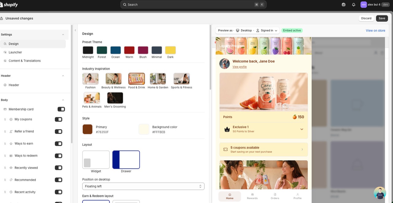
After we enable it, customize the new design in On-site content → Unified widget using the design token editor:
- Colors — primary, secondary, surface, on-surface, accent (with auto-contrast pairs)
- Typography — font family, size scale, weight, letter-spacing
- Shape — border radius scale (button, card, modal)
- Spacing — padding/gap scale across all blocks
- Custom CSS — still supported, now scoped via CSS custom properties
Want to roll back?
Reach out to support the same way and we'll switch your store back to the legacy widget.
Customize the Unified Widget
Open On-site content → Unified widget to fine-tune the new surface. Recent additions:
Match the widget to your store (On-brand)
Point On-brand at your storefront and Joy sets the widget's colors, button style, fonts, logo, imagery and copy to match your brand. On-brand is marked Beta.
On-brand reads a page of your storefront and maps what it finds onto the Unified Widget. You choose which parts to apply:
- Colors and theme — palette, button style, corner radius, and the fonts your theme uses.
- Logo and images — logo, avatar, and hero image from your storefront.
- Content voice — the widget text, rewritten to match how your brand speaks.
The button is read the way a shopper sees it, hover included. If your theme's button turns transparent on hover, or sweeps a color panel across itself, the widget's buttons do the same. Nothing reaches your storefront until you click Apply changes and save the widget. Every value stays editable afterwards.
Open the On-brand tab
Go to On-site content → Unified widget and open the On-brand tab. You can also click Try On-brand on the Match the widget to your store banner in the Design panel.
Enter the page to read
Storefront URL can be any public page, including a headless storefront or a page on a subdomain. Your home page works best: On-brand takes the theme from the page you enter, then reads the button style from one of your products.
If your storefront is password-protected, add the Storefront password. It works only with a URL on your own store's domain, unlocks it for this scan only, and is never stored.
Choose what to apply
Under Apply to, tick Colors and theme, Logo and images, Content voice, or any combination. Set the Language the rewritten copy is written in.
Click Generate
On-brand names each stage as it runs: opening your storefront, reading colors and fonts, finding a product page, checking the button and its hover, collecting your logo and imagery, working out what your store is about, and rewriting the copy.
Click Stop to cancel. A stopped scan changes nothing.
Review, then apply
Check the detected values and the rewritten labels in the live preview, change anything you want, then click Apply changes. Save the widget to publish.
Review what On-brand detected
Detected design lists six colors. Each one is editable before you apply:
| Color | Where the widget uses it |
|---|---|
| Button and accent color | Buttons, launcher, active footer item |
| Button text | Text on those buttons |
| Widget background | The widget's base background |
| Secondary color | A second brand color from your storefront |
| Body text | Paragraph text |
| Heading text | Headings |
The Detected logo appears next to them.
Brand overview is On-brand's summary of what your store is about. If the rewritten copy misses your voice, edit the overview and click Generate again. The rewritten labels are listed so you can edit any of them before applying.
On-brand remembers your last scan in this browser, so reopening the tab shows the same results without scanning again.
Keep buttons matched to your store
On-brand sets the button style once. To keep it tied to your storefront, use the Button style setting in the Design panel:
- Match store theme — Joy matches a visible primary button on your storefront.
- Joy preset — choose Solid, Outline, or Soft.
- Custom — your own settings.
On-brand notes
- No button found? Some pages have no primary button On-brand can read. When that happens, the button and accent color are skipped and the other colors, logo and imagery still apply. Enter a product page URL to pick up the accent color too.
- Video hero. If your storefront's hero is a video, On-brand uses the video's poster image.
- Copy not rewritten? If On-brand can't work out what your store is about, enter a different URL, such as your home page or an About page.
- Your storefront theme is never changed. On-brand only reads your storefront. It writes to the Joy widget settings in the editor, nothing else.
Widget mode: Loyalty or Customer Accounts
Under Design → Mode & content, Widget mode sets what the widget is for:
- Loyalty — points, rewards, referrals, and customer account tools.
- Customer Accounts — orders, addresses, profile, and product discovery, without loyalty content.
Switching mode asks you to confirm, because it replaces the home sections and account or loyalty cards, the footer navigation items, and the widget layout, program name and launcher. You can adjust individual sections again afterwards.
Customer Accounts mode hides the launcher button. Turn on Open Joy from the theme account button or link so your theme's account button and account/login links open the Joy drawer for guests and signed-in customers. Add data-joy-account-ignore to any trigger that should keep its native behavior.
Content style in the same group switches between Icons & text and Text only.
Neo-Brutalism style preset (Beta)
Under Style preset, Neo-Brutalism gives the widget a bold paper-cutout look: thick black borders, hard offset shadows, flat colors. Switching resets colors to the style's starting palette and changes corners, borders and shadows. Your content, sections and translations are not affected. Going back to Default restores the standard shapes and shadows and keeps your colors.
Preview with your storefront fonts
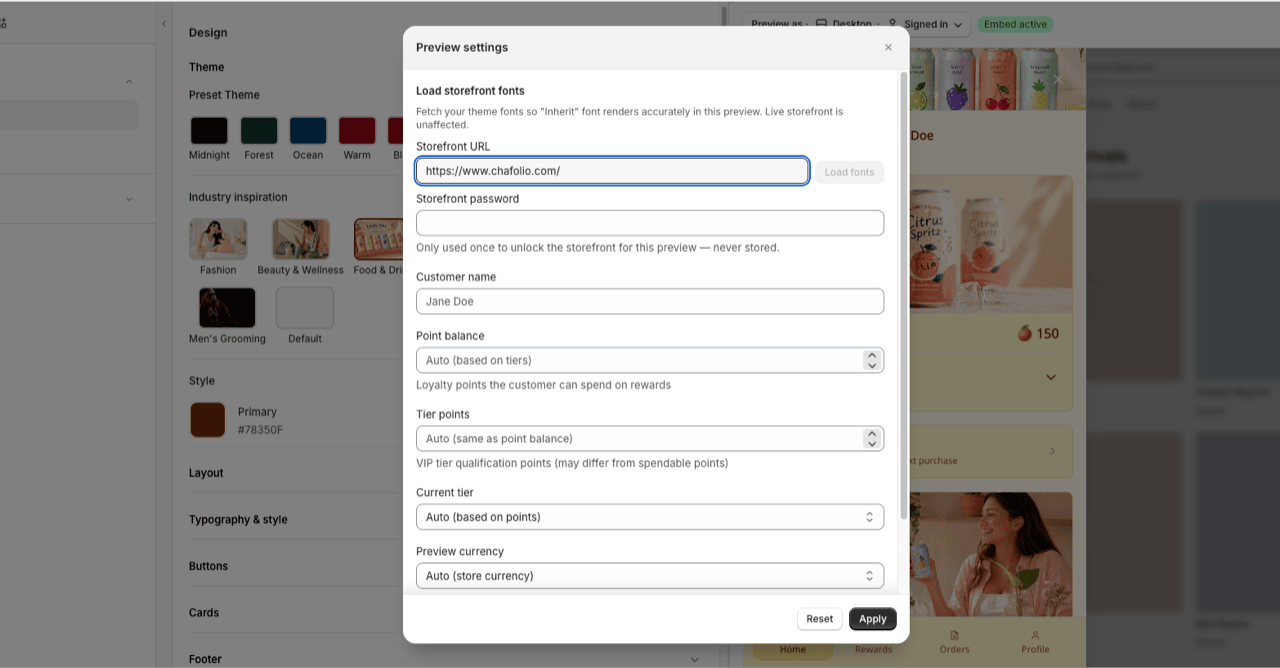
In the editor's Preview settings, enter your Storefront URL and click Load fonts so the "Inherit" font renders accurately while you design. If your storefront is password-protected, add the Storefront password (used once for this preview, never stored). Your live storefront is unaffected.
Floating drawer layout
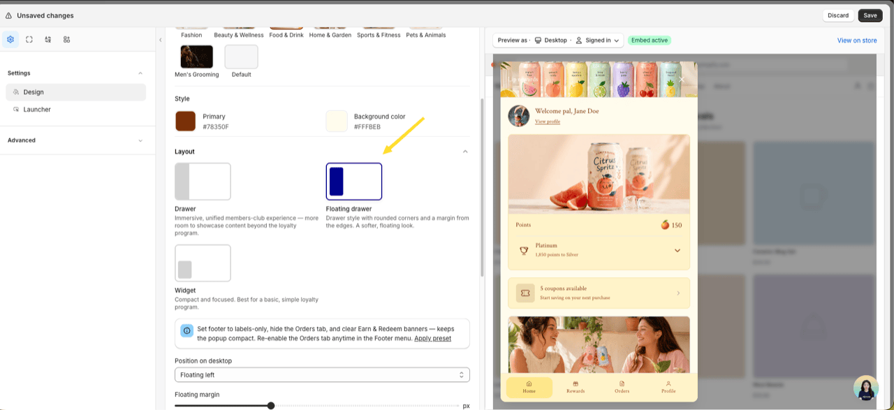
Under Design → Layout, pick Floating drawer — a drawer with rounded corners and a margin from the screen edges for a softer, floating look. Set the Floating margin (8–32px). On mobile it still stacks into a bottom sheet like the standard drawer.
Always show the tier progress bar
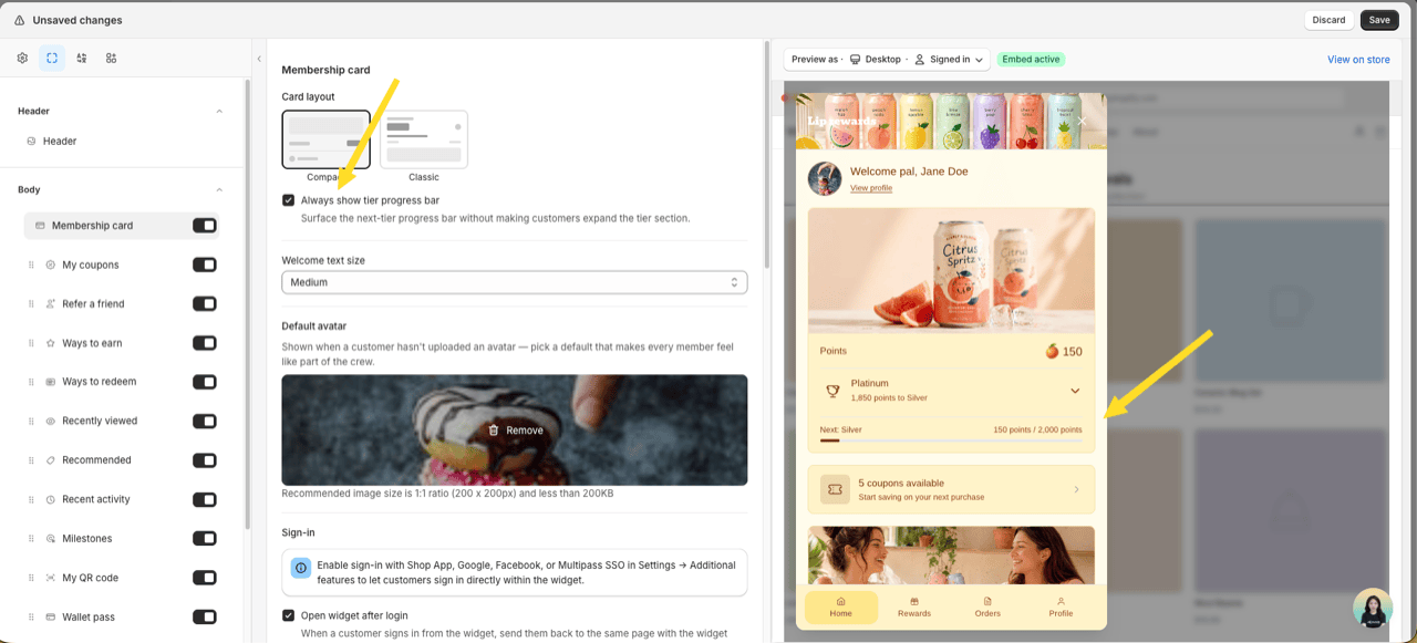
In Membership card settings, turn on Always show tier progress bar to surface the next-tier progress bar without customers expanding the tier section. Works for both Compact and Classic card layouts.
Show perk type labels
In Membership card settings, turn on Show perk type labels to add "Entry reward:" in front of entry rewards and "Referral reward:" in front of the referral reward in each tier's perk list. It is off by default.
The "Referral reward:" line appears only while your referral program is active and gives rewards by VIP tier. The widget preview in the editor shows the same labels.
More editor improvements
- Welcome greeting variables — use
{customer_name},{customer_firstname}, or{customer_lastname}in the Welcome back greeting. Specific-name variables override the "Customer name display" setting. - Per-program detail image — give each earning/redeeming program a separate hero image for its detail view, on top of the small list icon.
- Recommended cold-start fallback — choose which browsing signal personalizes recommendations (Personalize from) and a Fallback collection shown when no signal matches.
- Province / State field — the address form now collects province, state, or prefecture (e.g. Japan), so saving an address no longer clears it.
- Page transition — animate view changes with None, Slide, or Fade (Design → Layout).
Show external discounts in My coupons
You hand out Shopify discount codes all over the place — Shopify Admin, Klaviyo, Shopify Forms, Mailchimp popups — and customers lose track of them. External discounts lets you pick up to 10 existing code-based Shopify discounts and show them in the widget's My coupons card, right next to your Joy reward coupons.
Joy never creates, edits, or deletes discounts. It only displays codes that already exist in your store, so customers find every offer in one place instead of digging through old emails.
Only code-based Shopify discounts are supported (percentage, fixed amount, free shipping, and Buy X Get Y). App discounts built with Shopify Functions and automatic discounts aren't — Shopify doesn't expose an app discount's value and conditions, and an automatic discount has no code to show.
What customers see in My coupons
- Synced codes in My coupons, mixed in with Joy reward coupons — each with its code, value, and conditions shown the same way as a Joy coupon.
- Values render just like real coupons: 20% off, $15 off, Free shipping, or Buy 1 get 1 free (Buy X Get Y), along with conditions such as minimum spend or minimum quantity.
- No Revoke button — these aren't Joy rewards, so there's nothing to give back.
- A code the customer has already used, or one that's expired, moves to the Unavailable tab with a Used or Expired badge — exactly like a Joy coupon.
Note: Joy controls who sees a code. Customers must still meet the discount's own Shopify eligibility to apply it at checkout.
Set up external discounts
Open the External discounts panel
Go to On-site content → Widget → Unified Widget. Open the Advanced group and find the External discounts panel.
Turn on External discounts
Toggle Show external discounts in My coupons on. An info banner explains how visibility works, and the Add discount button appears.
Add your discounts
Click Add discount, search by code or title, and select one or more discounts. The picker shows each code's value and eligibility, and lists only code-based discounts that aren't Joy's own. You can add up to 10.
Review the list
Each added discount shows its Code (with value and conditions) and its Shown to eligibility — All customers, Specific customers, or Eligible customer segments. Use the trash icon to remove one.
Save and publish
Save and publish with the widget editor's main Save bar. Synced discounts appear in My coupons for eligible, logged-in customers.
Who can see each discount
A synced discount shows to a logged-in customer only when all of these are true. Joy filters this on the backend, so codes never leak to customers who aren't eligible:
- The discount is active and not expired.
- Its shop-wide usage limit hasn't been used up.
- The customer matches the discount's Shopify customer eligibility:
- All customers → every logged-in customer sees it.
- Specific customers → only those customers see it.
- Eligible customer segments → only customers in the segment see it.
- If the discount is limited to one use per customer and that customer has already used it, it moves to the Unavailable tab with a Used badge.
Logged-out visitors never see synced discounts.
Will my Joy reward coupons show up twice?
No. Joy automatically excludes its own reward coupons from the picker and the list.
What about discounts limited to specific markets?
Market-restricted discounts can't be shown yet. To reach specific customers, put them in a Shopify customer segment and target that segment on the discount instead.
Where does this appear?
The Unified Widget's My coupons card only. It isn't on the customer account page, loyalty page, or embedded blocks yet.
SMS marketing consent in the widget Profile
When a logged-in shopper opens the widget Profile, the Settings section lets them opt in or out of your marketing channels, and Account info lets them add or update their phone number. Consent syncs straight to the customer's Shopify marketing consent, so your email and SMS tools stay in step with what the shopper actually agreed to.
What shoppers see in their Profile
- Email marketing — a simple on/off toggle. No phone needed.
- SMS marketing — an on/off toggle labelled SMS marketing ("Receive promotions and special offers via SMS"). Because SMS needs a mobile number, it only activates once the shopper has a phone number on file. Until then it stays disabled with an "Add your phone number above to enable SMS marketing" note.
- Phone number — always shown in Account info with an Add your phone number prompt when empty. Shoppers pick a dial code and enter their number; Joy saves it to their profile and to Shopify.
Only logged-in shoppers see the Profile Settings block — guests don't.
How consent is saved
- Turning on SMS marketing subscribes the shopper (single opt-in) and writes their consent to Shopify. Email marketing does the same for email.
- If the update fails, Joy reverts the toggle and shows a message — the widget never displays a state that didn't save.
Joy only records consent to Shopify. Sending the actual SMS or email is handled by your marketing tools (Shopify, Postscript, Klaviyo, etc.).
Show or hide the consent toggles
Open the Unified widget designer
Go to On-site content → Unified widget.
Go to the Profile Settings block
In the widget designer, open Sections → Profile → Settings.
Turn each consent option on or off
- Show email marketing consent — Let customers opt in to email marketing from the widget.
- Show SMS marketing consent — Let customers opt in to SMS marketing from the widget.
Turn either off to hide it from the storefront Profile. When both are off, the Settings block is hidden entirely.
Rename or translate the consent copy
The consent labels, descriptions, and phone prompts are translation strings — edit them under Translations, not the widget designer:
- Go to Joy Loyalty → Settings → Translations and open Unified widget.
- In the Profile section, edit the strings you want — SMS marketing, its description "Receive promotions and special offers via SMS", the "Add your phone number" prompt, or the "Add your phone number above to enable SMS marketing" note.
- Translate each for the languages you support. Keep any
{{variable}}placeholders in English.
What changes for your customers
| Surface | Legacy widget (V3) | Unified Widget |
|---|---|---|
| Floating widget (FAB + drawer/popup) | Preact, fixed layout | Web Component, customizable layout |
| Loyalty landing page | Single template | 10 modular blocks (Hero, How it Works, Ways to Earn, Ways to Redeem, VIP, Referral, Activity, FAQs, etc.) |
| Account page | Plain HTML | 4 dedicated blocks (points, tier, activity, redeem) |
| Cart drawer redeem | Static button | <joy-redeem-cart> web component, theme-aware |
| Points calculator | Inline DOM | <joy-points-calculator> web component, variant-aware |
Frequently asked questions
Will this break my current widget?
No. Your legacy widget keeps running until our team enables the Unified Widget on your store.
Do I need to redo my branding settings?
No. Your current colors, fonts, and button styles auto-map to the Unified Widget's design tokens when it's enabled. You can fine-tune from there.
What happens to features not yet migrated?
Milestone program UI, interactive website popup, Wallet pass / QR, Submit receipt program, and branded reminder popup remain on the legacy widget. Joy auto-falls back when the customer hits one of those flows — no broken UI.
Can I roll back?
Yes. Contact support and we'll switch your store back to the legacy widget.
Does the Unified Widget affect Shopify Flow, Klaviyo, or other integrations?
No. It only changes the storefront view layer. All triggers, events, API endpoints, and webhook payloads remain identical.
When will the remaining features migrate?
Tracked on the Roadmap. Subscribe to the changelog to get notified.
Need help?
Reach out at [email protected] with your store URL and "Unified Widget" in the subject — we'll handle enable, rollback, and any setup questions.